Introducing TraceRoot dashboards
TraceRoot dashboards bring agent latency, cost, tokens, and failures into configurable views, with a widget builder and links to the underlying traces.
 Xinwei He
TraceRoot dashboards let you follow latency and cost over time, compare token use by model, and open individual traces when something needs a closer look.
If responses are getting slower, compare latency with request volume, token use, and failures over the same period to see what else changed.
Start with the default dashboard
The default dashboard includes trace count, total cost, token use, and p95 latency. It also includes cost over time by model, tokens by model, recent traces, and recent failures. You can edit it and arrange the widgets around the questions your team checks most often.
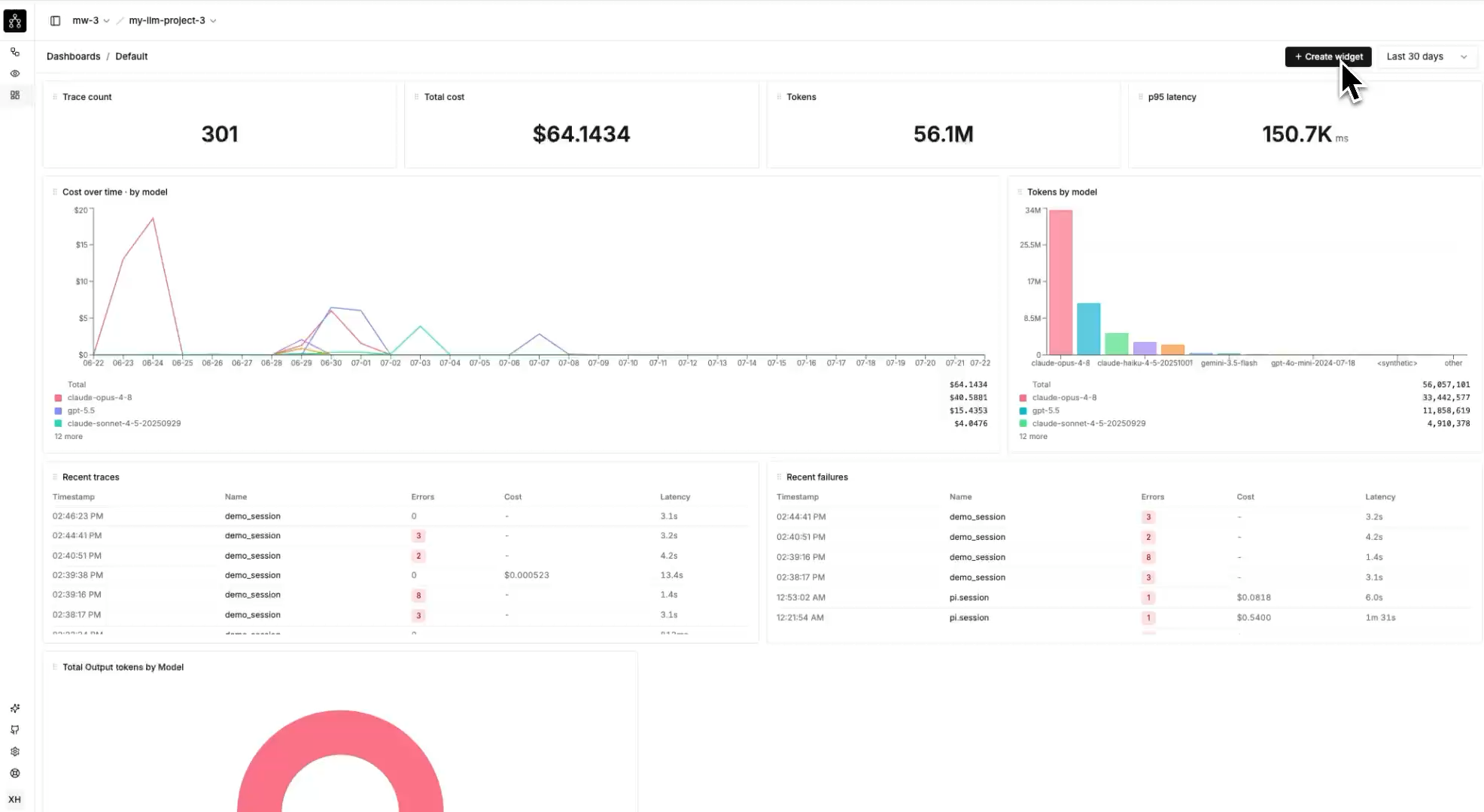
Follow cost and token use by model, with recent traces and failures below.
Open a row in the trace feed to inspect the run and its spans, including tool inputs and model responses. If a latency chart shows a slowdown, the trace helps you find which calls took longer.
Build a view around your question
The widget builder lets you choose trace or span data, apply filters, select a metric and aggregation, and pick a visualization. Its preview uses your project's data over the selected date range, so you can check the result as you configure the widget, before saving it.

Average output tokens by session, previewed in the widget builder.
Choose Output tokens as the metric, avg as the aggregation, and Session as the grouping to build this view. You can change those settings to make a different comparison before saving the widget and arranging it on the dashboard.
Open Dashboard in your project to start with the default view or create your own.